Do You Believe Your (Social Media) Data? A Personal Story on Location Data Biases, Errors, and Plausibility as well as their Visualization
Description:
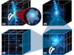
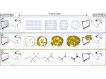
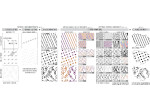
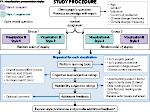
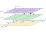
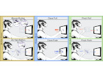
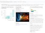
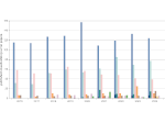
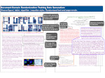
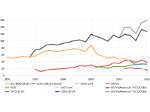
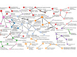
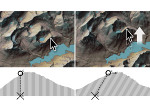
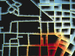
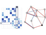
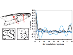
We present a case study on a journey about a personal data collection of carnivorous plant species habitats, and the resulting scientific exploration of location data biases, data errors, location hiding, and data plausibility. While initially driven by personal interest, our work led to the analysis and development of various means for visualizing threats to insight from geo-tagged social media data. In the course of this endeavor we analyzed local and global geographic distributions and their inaccuracies. We also contribute Motion Plausibility Profiles—a new means for visualizing how believable a specific contributor’s location data is or if it was likely manipulated. We then compared our own repurposed social media dataset with data from a dedicated citizen science project. Compared to biases and errors in the literature on traditional citizen science data, with our visualizations we could also identify some new types or show new aspects for known ones. Moreover, we demonstrate several types of errors and biases for repurposed social media data.
Paper download:
Demo Source Code and Data:
 As described at the end of the paper, we purposefully do not share any data and use only coarse or anonymized maps in the published materials to prevent poaching of the endangered plants. We provide, however, the script that can generate the Motion Plausibility Profiles for iNaturalist data, for any chosen species or group of species. The same script is also available through GitHub. To be able to use it, you still need to download your own data from iNaturalist and adjust the script accordingly. The script reproduces all motion plausibility profiles for the iNaturalist data as shown in the paper (along with some other visualizations we used), but of course based on the data exported at the time of download.
Video:
live presentation at IEEE  :
:
pre-recorded presentation from IEEE  :
:
30 second paper fast-forward at IEEE  :
:
30 second poster preview at IEEE  :
:
Get the videos:
- watch the live presentation video on YouTube
- watch the pre-recorded presentation video on YouTube
- watch the 30s paper fast-forward on YouTube.
- watch the 30s poster preview on Vimeo.
Pictures:
All self-created pictures that we use and discuss in the paper are available under a Creative Commons Attribution 4.0 International (CC-BY 4.0) license in a dedicated OSF repository.
Additional related work that we missed in our paper's discussion:
- Describing place though user-generated content by Purves et al.: discussion of some forms of bias in social media image data, in particular the power law behavior for the contribution counts (and thus the light-green field for individual poster contribution skew bias for “repurposed” social media data in our Table 1 should, in fact, have a white background)
- Understanding movement data quality by Andrienko et al.: discussion of errors in movement data and their visualization
Additional Material:
We have included all additional material (many additional visual representations) in the main PDF files linked from these pages. This way the hyperlinks between the main paper and the visual representations in the additional material are maintained.
Misc:
The presentation received the unofficial »Michael Correll's favorite IEEE VIS 2022 presentation« award; thanks, Michael! 😄
Poster presented at IEEE  on the initial tool:
Main Reference:
Other References:
| Tobias Isenberg (2024) Visualization of Species Distributions based on Social Media Data and a Couple of Surprises and Insights. Keynote talk at VCBM, September 2024. | | ||
This work was done at the AVIZ project group of Inria, France.
